

Client
Tommyknocker Brewery
Industry
Food & Beverage
Partner
Ember Design
(01)
Project overview.
Tucked in the Rockies with decades of mountain-town lore behind it, Tommyknocker Brewery had the name recognition, but not the shelf presence. Their brand felt stuck in the past, missing the mark with a new wave of drinkers who split time between city life and weekend trails.
This was a full-on brand reset. I co-led creative direction across packaging, digital, and print, helping shape a visual system that honored their legacy while dialing up the edge, craft, and personality needed to compete today.
(02)
Challenge.
Tommyknocker’s identity was rooted in local legend, but the look hadn’t aged well. The brand leaned heavily into old-school charm, with visuals that felt dated and disconnected from the craft beer crowd coming up behind their longtime loyalists.
The ask: build a system that could speak to younger, design-savvy drinkers without losing the character that made Tommyknocker a mountain-town staple. We needed to keep the heart but modernize the face.


(03)
Result.
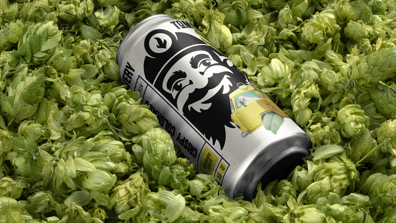
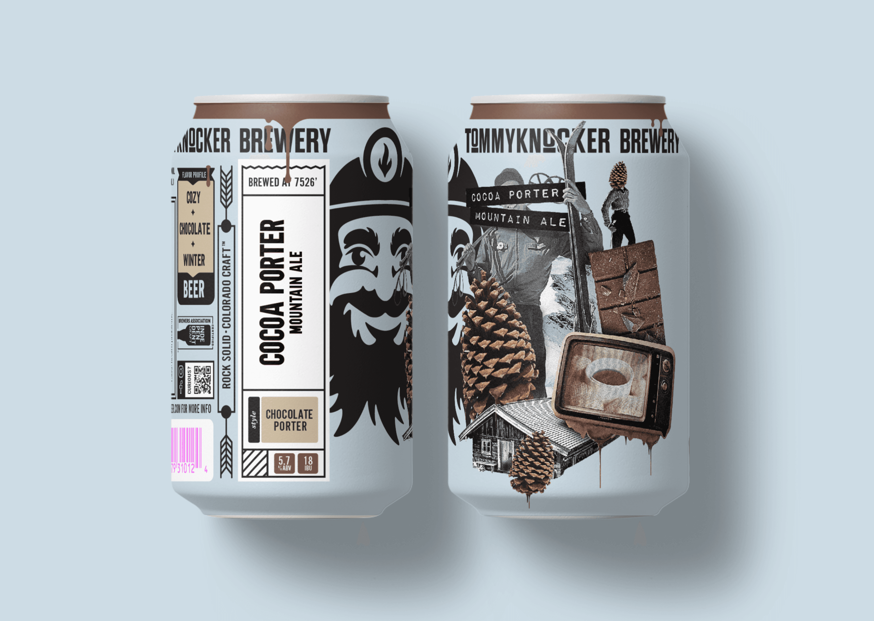
We rebuilt the brand from the ground up. Starting with a brighter, bolder palette, we evolved their typography to feel cleaner, stronger, and easier to read on crowded shelves. The iconic Tommyknocker figure was scaled up and simplified to own more visual real estate, giving the brand a stronger anchor.
Our collage-style illustrations brought a sense of movement and grit to the packaging, echoing the blend of nature, rebellion, and small-town weirdness that defines the area. Every element, from the in-house menus to the redesigned website, worked together to feel handcrafted, fresh, and ready for the next generation of drinkers.


(Projects)


